As a senior business analyst, I spend a lot of my time looking at data. I gather numbers, analyze trends, and present my findings to the executive team.
My goal is always the same. I want to tell a clear and accurate story with data. I want to give leadership the right information so they can make smart decisions.
But over the years, I have seen a big problem. Even the best data can tell the wrong story if it is not presented well. When we create reports, we rely heavily on charts and graphs.
Data visualization is a powerful tool. It helps us see patterns that are hidden in spreadsheets. However, it can also be dangerous.
A poorly designed chart can accidentally mislead people. When those people are executives making big company decisions, a simple formatting mistake can cause real trouble.
We are not talking about lying with data on purpose. Most analysts are honest. The problem comes from simple formatting choices. We might think a chart looks “pretty” or “cool,” but we fail to see how it might confuse the person reading it.
In this article, we will look at three common chart formatting traps. These are mistakes that can easily happen in executive reporting, leading to bad business decisions. We will talk about why they happen and how to avoid them.
Trap 1: The Misleading Y-Axis
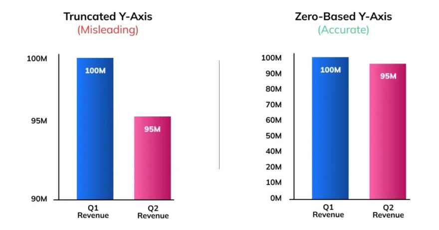
This is perhaps the most common data visualization mistake I see. It is the trap of the broken or manipulated y-axis.
When we create a bar chart or a line graph, the y-axis usually shows the value or the amount. For example, it might show sales revenue, customer numbers, or profit margins. To give an accurate picture, the y-axis should almost always start at zero.
Why is this so important? Because our brains judge the size of the bars or the steepness of the line to understand the data. If a bar is twice as tall as another bar, our brain tells us the value is twice as big.
But what happens when you do not start the y-axis at zero? You cut off the bottom part of the chart. This makes small differences look huge.
Imagine you are looking at sales for two months. In January, you sold 1000 units. In February, you sold 1050 units. This is a 5% increase. It is a good increase, but not a massive one.
Now, imagine a bar chart where the y-axis starts at 950 instead of zero. The bar for February will look twice as tall as the bar for January! An executive looking at this chart might think sales have doubled. They might decide to hire more staff or buy more inventory based on this false impression.
This is a classic chart formatting trap. It often happens by accident. Many charting programs, like Excel, automatically adjust the y-axis based on the data. They try to make the chart look full. But this automatic setting can create misleading graphs.
How to Avoid This Trap
The solution is simple. Always check your axes.
- Start Bar Charts at Zero: For bar charts and column charts, the y-axis must start at zero. There are very few exceptions to this rule in standard business reporting.
- Be Careful with Line Graphs: Line graphs are a bit different. They are used to show trends over time. Sometimes, if the changes are very small, starting at zero makes the line look flat. In these cases, you might zoom in on the y-axis. However, you must clearly show that you have done this. Do not try to hide it.
- Provide Context: Always ask yourself what story the chart is telling. Does the chart make a 2% change look like a 50% change? If so, you need to fix the formatting.
When executives are reviewing business performance, they need the truth. Misleading axes can lead to poor resource allocation and bad strategic planning.
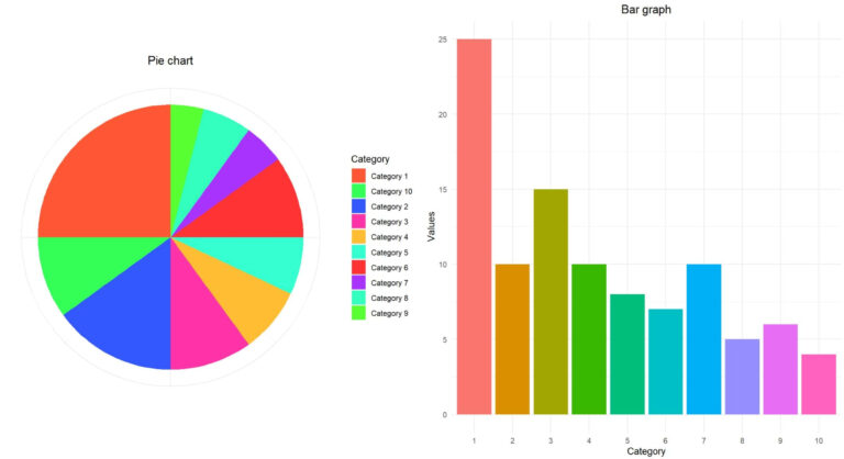
Trap 2: The Pie Chart Overload
Pie charts are everywhere in business presentations. People love them. They look friendly and colorful. They seem like an easy way to show how a whole is divided into parts. For example, you might use a pie chart to show market share or a budget breakdown.
But as a data analyst, I have a complicated relationship with pie charts. They are often misused, and they can easily become a formatting trap.
The human brain is not very good at judging angles or area. We find it hard to look at two slices of a pie chart and know exactly which one is bigger, especially if they are close in size. We are much better at comparing the length of straight lines, like in a bar chart.
The real problem happens when pie charts get overloaded. This is the second trap. A pie chart with two or three slices is okay. But what happens when you have ten or fifteen categories?
The chart becomes a mess of tiny slivers. It is impossible to read. The labels overlap, and the colors start to look the same. To make it “easier” to read, people often add a legend. Now, the executive has to look back and forth between the tiny slices and the legend, trying to match the colors. This is frustrating and inefficient.
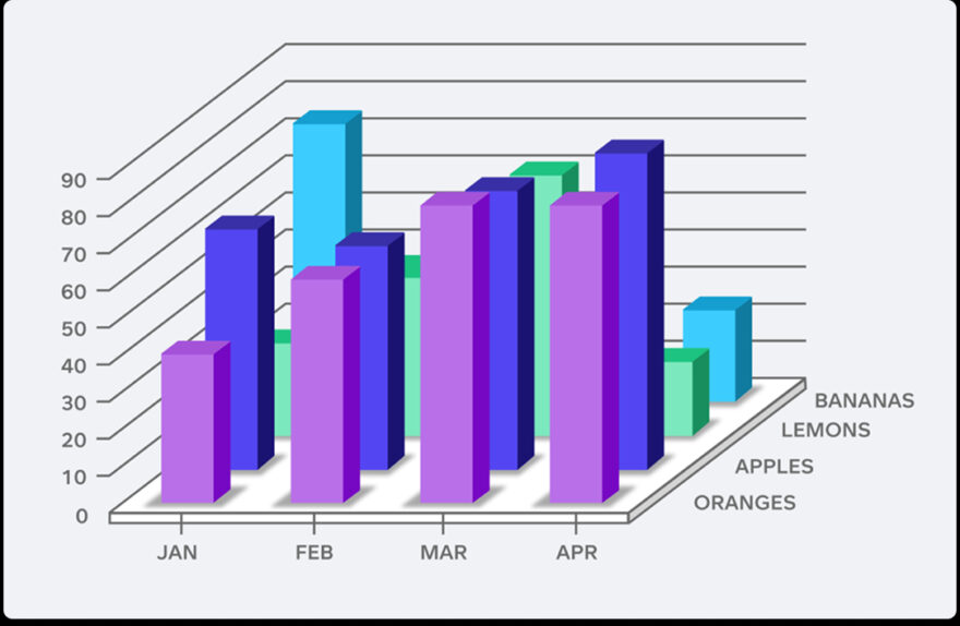
Worse still is the 3D pie chart. Making a pie chart 3D is a terrible data visualization mistake. It distorts the data. The slices at the front of the 3D pie look bigger than the slices at the back, even if they represent the same value. This is a perfect example of poor chart design misleading an audience.
How to Avoid This Trap
We need to stop relying so heavily on pie charts for complex data.
- Limit the Slices: Only use a pie chart if you have fewer than five categories. If you have more, find another way to show the data.
- Use Bar Charts Instead: For comparing many categories, a horizontal bar chart is almost always better. It is easier to read, you can fit more labels clearly, and the human brain can compare the lengths easily.
- Never Use 3D: Turn off all 3D effects in your charting software. They add no value and only distort the truth.
Executives do not have time to decode messy charts. They need quick, clear insights. An overloaded pie chart wastes their time and can hide important details. If you want to learn how to choose the right chart types and present data effectively, you should consider professional training. A good Power BI course can teach you the best practices for creating clear, impactful dashboards.
Trap 3: Poor Color Choices and Clutter
The third trap is about aesthetics and clarity. It is about how the chart looks and feels. Often, we try to make our charts look “designed” and we end up making them confusing.
One major issue is poor color choices. Color should be used to communicate meaning, not just for decoration. A common mistake is using a rainbow of colors for no reason. If you have a bar chart showing sales for different regions, and every bar is a different bright color, the chart becomes overwhelming. The colors do not tell the reader anything new. They just distract the eye.
Another color trap is not thinking about color blindness. Red and green are often used to show bad and good performance. But red-green color blindness is very common. An executive who is color blind might just see a sea of brown and miss the whole point of your chart.
Beyond color, there is the problem of clutter. We call this “chartjunk.” This includes things like heavy gridlines, dark backgrounds, unnecessary borders, and too many data labels.
When you add too much visual clutter to a chart, the actual data gets lost. The executive has to work hard to see the trend through the gridlines and the bright colors. This cognitive load makes it harder for them to understand the message and make a decision.
A clean, simple chart is always more powerful than a complicated, messy one.
How to Avoid This Trap
Less is more when it comes to chart design.
- Use Color with Purpose: Stick to a simple color palette. Use one main color for your data points. Use a contrasting color only when you want to highlight something specific, like the best performing region or a sudden drop in sales.
- Design for Accessibility: Avoid relying solely on red and green to communicate meaning. Use different shades, add icons, or use labels to ensure everyone can understand the chart.
- Remove the Junk: Strip away anything that does not help tell the story. Remove background colors. Lighten or remove gridlines. Take off unnecessary borders. Only use data labels if the exact number is important. Let the shape of the data speak for itself.
Conclusion: Clarity Over Flash
Creating data visualizations for executives is a big responsibility. As business analysts, we are the bridge between raw data and strategic decisions. We must make sure that bridge is strong and clear.
The three traps we discussed are the misleading y-axis, the pie chart overload, and poor color and clutter. These are not malicious lies.
They are accidental formatting mistakes. But their impact can be significant. They can cause leaders to misunderstand trends, miss important details, and make bad choices.
The key to good data visualization is clarity. We should always prioritize truth over flash. A simple, well-formatted bar chart is far more valuable than a confusing 3D pie chart.
By avoiding these common traps, we can ensure that our data tells the right story and helps our organizations succeed.